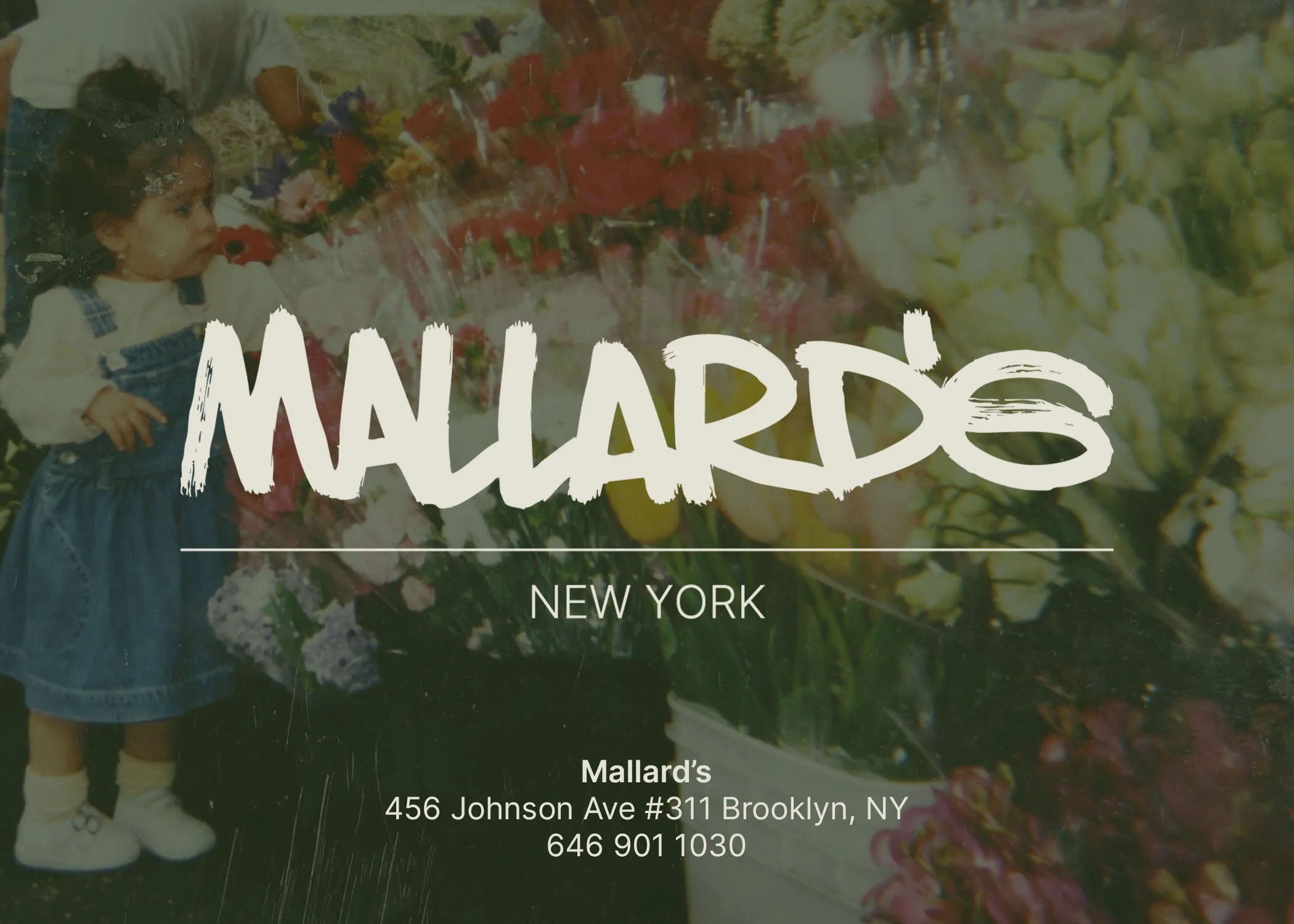
Mallard’s is a salon built of expression, of family, of New York and of growing up surrounded by community.
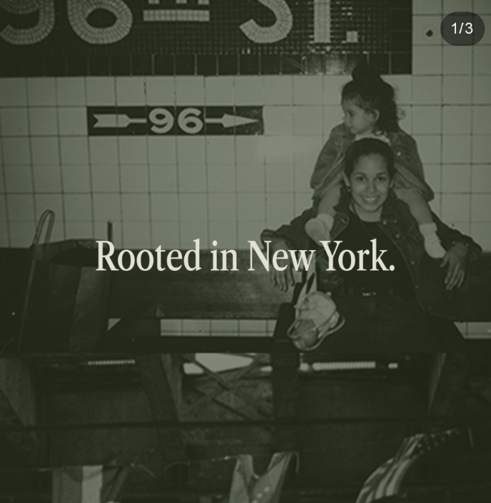
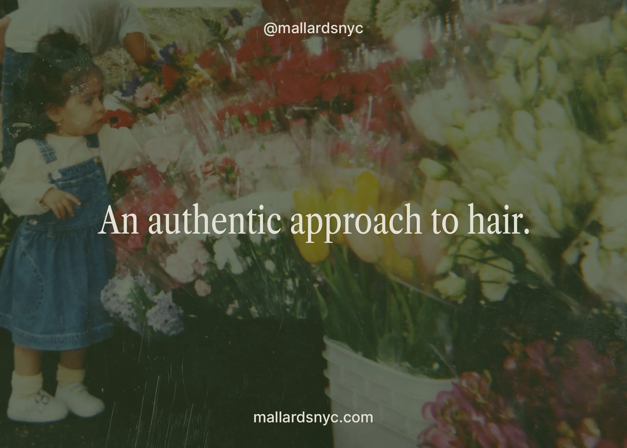
Inspired by the owners personal archives, film images and the city she grew up in. redefining what a modern salon can look and feel like and a result that is something both nostalgic and quietly modern. The project involved building a full visual system from logo, color, photography direction and social templates.
art direction: puteri cardinale
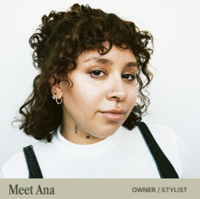
founder: ana maria german
social
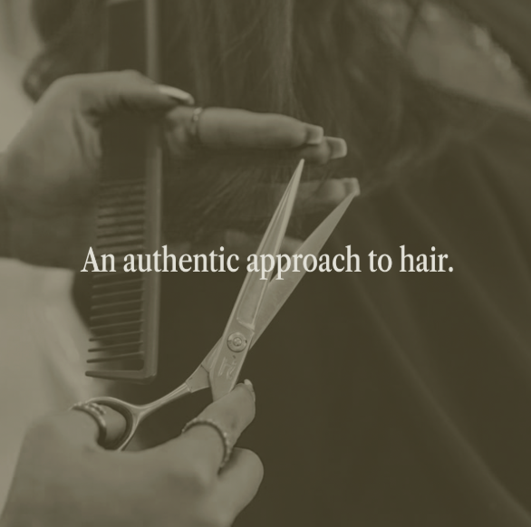
A flexible social system was developed to translate the brand identity into consistent, recognizable moments across platforms. Templates like “Roots” reinforce the brand’s narrative through layered imagery and typography, while maintaining enough openness to feel organic and personal rather than overly designed.
the direction.
brand identity
the brand identity translates Mallard’s foundation of family, memory, and New York into a cohesive visual system. Balancing nostalgia with a modern sensibility, the approach creates a world that feels personal, familiar, and consistent across all touch points.
logo & color
the logo is designed to reflect a sense of authenticity. A structured set of guidelines ensures clarity and consistency across both digital and physical applications. The color palette is a a muted, nature driven palette evokes warmth, familiarity, and heritage. Rich tones are balanced with softer neutrals to create contrast while maintaining a cohesive and understated visual language.
social